

Imagine landing on a website with dull, clashing colors versus one that instantly draws you in with balanced, brand-aligned hues. You probably won’t stay on the first one long.
That’s not coincidence—it’s color psychology at work.
In the fast-evolving digital landscape of 2025, color psychology in web design is no longer just a matter of aesthetics. It’s a strategic tool that influences how visitors feel, behave, and convert.
From building brand trust to nudging clicks on a CTA, your color choices can significantly impact everything from user experience to conversion rate optimization.
This blog explores the powerful role color plays in modern website design and how smart color strategy can turn casual visitors into loyal customers.
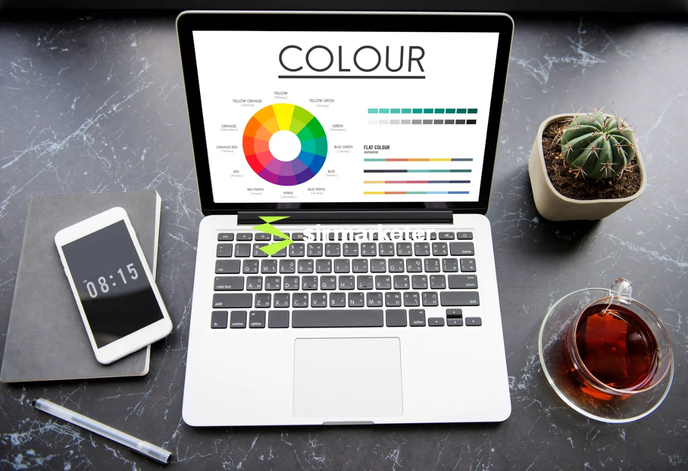
“Color is the silent ambassador of your brand.”
— Sir Marketer, Digital Dream Team

Color psychology is the study of how colors influence human emotions, perceptions, and actions. When applied to web design, it becomes a visual language that communicates brand identity, builds trust, and guides user behavior.

In short, color isn’t decoration—it’s persuasion.

A). Shorter attention spans
Users form an impression in under 50 milliseconds—colors help you grab that attention fast.
B). Mobile-first behavior
With smaller screens, color becomes critical in visual hierarchy and navigation.
C). Rise of brand-first design
Consumers expect cohesive branding across web, social, and packaging—and color is the cornerstone.
D). Emotion-driven decisions
Colors evoke emotional reactions that guide decision-making—especially during purchases.
A good digital marketing company like Sir Marketer considers color from the UX, branding, and conversion angle all at once.
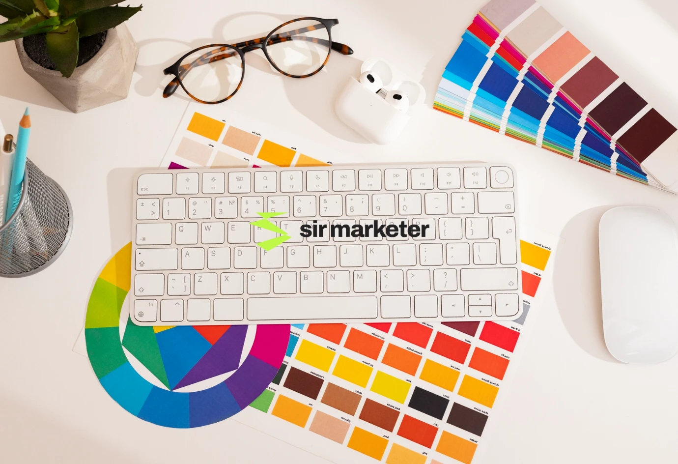
Each color sends a psychological signal to users. Here’s what they typically evoke:
🔵 Blue – Trust, calm, professionalism
Used by: PayPal, Facebook, LinkedIn
Perfect for: Tech, finance, corporate, SaaS
🔴 Red – Passion, urgency, excitement
Used by: Coca-Cola, Netflix
Perfect for: Sales promotions, calls to action, food, fashion
🟢 Green – Growth, health, tranquility
Used by: Spotify, Whole Foods
Perfect for: Wellness, eco-brands, finance (profit symbolism)
🟡 Yellow – Optimism, warmth, energy
Used by: McDonald’s, IKEA
Perfect for: Youth-focused brands, food, lifestyle, onboarding
🟠 Orange – Playful, confident, energetic
Used by: Fanta, SoundCloud
Perfect for: Retail, eCommerce, travel
⚪ White – Simplicity, purity, space
Used by: Apple, ASOS
Perfect for: Luxury, tech, minimalist websites
⚫ Black – Power, elegance, mystery
Used by: Chanel, Nike
Perfect for: Fashion, luxury, high-end tech
🟣 Purple – Creativity, luxury, spirituality
Used by: Yahoo, Cadbury
Perfect for: Beauty, design, education, innovation
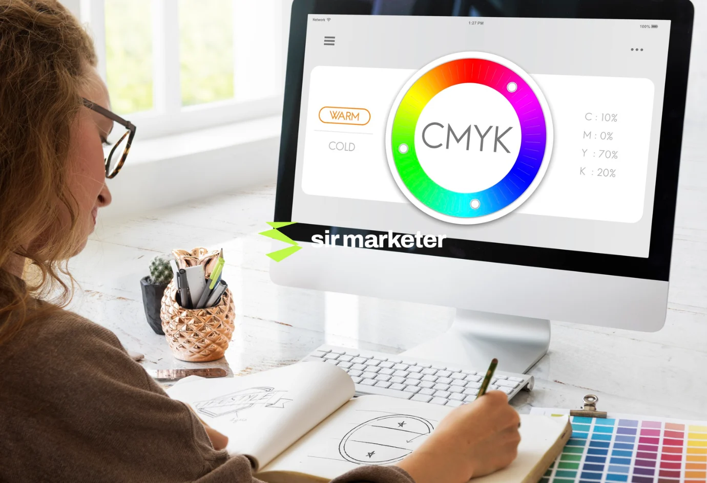
1. Know Your Audience
What emotions do you want your audience to feel? Trust? Excitement? Safety?
2. Understand Your Brand
Are you bold and energetic, or refined and sophisticated? Your primary color should reflect that personality.
3. Consider the Industry Norm
It’s okay to break the mold—but understanding what colors your competitors use can help you make strategic choices.
4. Keep Accessibility in Mind
Use high-contrast combinations for readability and visual impairments (ADA compliance).
5. Stick to a Palette
Limit yourself to 3–5 main colors:
Primary
Secondary
Accent
Background
Text
Use tools like Coolors, Adobe Color, or Material Design Palette Generator to create your brand palette.
A). Brand Identity
Your logo, header, and primary elements should instantly convey your brand vibe.
B). Navigation and CTAs
Use bold accent colors for buttons, links, and menus to guide user flow and boost click-through rates.
C). Forms and Conversions
Test button colors for lead capture forms—red, green, and orange typically convert well.
D). Error and Success States
Use intuitive colors like green (success), red (error), yellow (warning) for system messages.
E). Content Hierarchy
Color can help distinguish sections, highlight content, and improve scannability.

A). Dropbox
Uses soft blues and whites for a clean, trustworthy interface that appeals to businesses.
B). Spotify
Combines bold green and black for a modern, energetic feel that fits its youthful audience.

Mistake | Why It Hurts |
|---|---|
Too many colors | Creates chaos and dilutes brand identity |
Low contrast text/background | Hurts readability and accessibility |
Inconsistent palette usage | Confuses users and weakens brand presence |
Over-reliance on red/green | Not colorblind-friendly |
Ignoring cultural context | Some colors have different meanings globally |
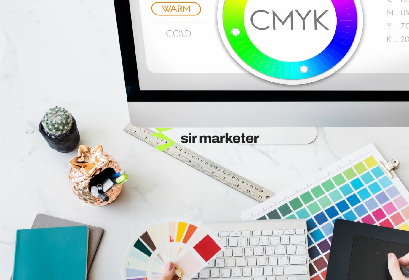
Color influences where users look, what they remember, and whether they click. It’s not just decoration—it’s persuasion by design.

You don’t have to guess. Run tests like:
Google Optimize
VWO
Crazy Egg
can help you see which colors perform best with your audience.
At Sir Marketer, we craft websites with conversion-focused color strategies built on:

Whether you’re building a fresh brand or redesigning a legacy site, our team ensures your colors speak louder than words—and convert better too.
Your website has a voice. It speaks through layout, motion, and above all—color.
In 2025’s highly visual and competitive online world, understanding color psychology in web design is no longer optional. It’s essential for brands that want to stand out, be remembered, and drive action.
Get the colors right, and you’re not just designing a website—you’re building trust, guiding users, and growing revenue.
Our team will answer all your questions. we ensure a quick response.